How Data Bars work in Excel Conditional Formatting
Excel's Data Bars conditional formatting option inserts horizontal bars inside cells to display the importance of a number in relation to other values within the chosen range. The value increases with the length of the bar.
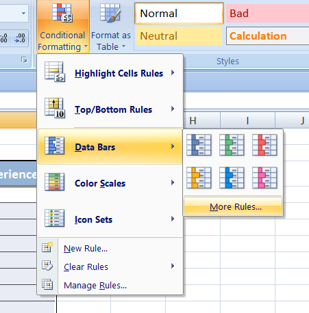
Key points:
- Visual, not changing the data.
- Access: Home > Conditional Formatting > Data Bars (choose a style).
- Min/Max can be auto, number, percent, or percent of total.
- Useful for quick comparisons across a range.
Blue Data Bar
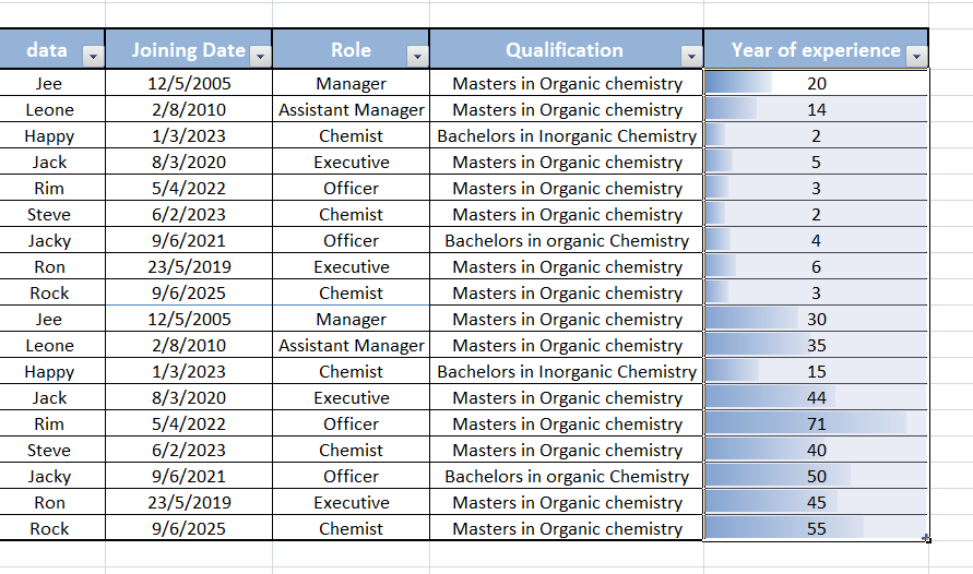
View a Blue colored data bar in the cell. The length of the data bar represents the value in the cell. A longer bar represents a higher value.
Green Data Bar
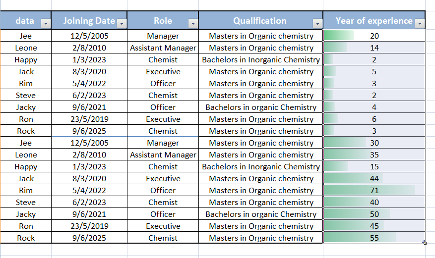
View a Green colored data bar in the cell. The length of the data bar represents the value in the cell. A longer bar represents a higher value.
Red Data Bar
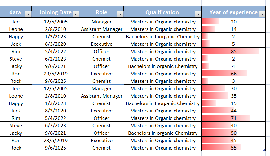
View a Red colored data bar in the cell. The length of the data bar represents the value in the cell. A longer bar represents a higher value.
Orange Data Bar
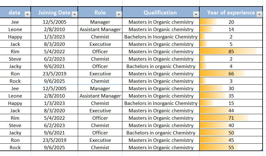
View a Orange colored data bar in the cell. The length of the data bar represents the value in the cell. A longer bar represents a higher value.
Light blue Data Bar
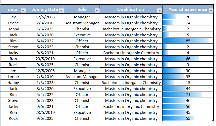
View a Light blue colored data bar in the cell. The length of the data bar represents the value in the cell. A longer bar represents a higher value.
Purple Data Bar
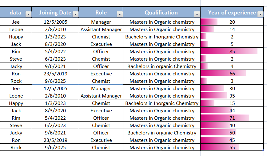
View a Purple colored data bar in the cell. The length of the data bar represents the value in the cell. A longer bar represents a higher value.
Click on below link to get further information-
https://olivaa.odoo.com/blog/excel-5/color-scale-format-in-excel-84